This page brings together selected projects created in alignment with my application to the ACLU of Texas Artist-in-Residence program. The work centers protest, publishing, and participatory design as tools for visibility, collective care, and civic engagement, with a focus on gender, bodily autonomy, protection, and belonging.
Using accessible formats such as risograph prints, posters, zines, and workshops, these projects prioritize circulation beyond traditional art spaces and are rooted in collaboration, consent, and community-led authorship.
Many of these projects engage trans and gender-expansive communities and reflect my commitment to civil rights work in Texas.
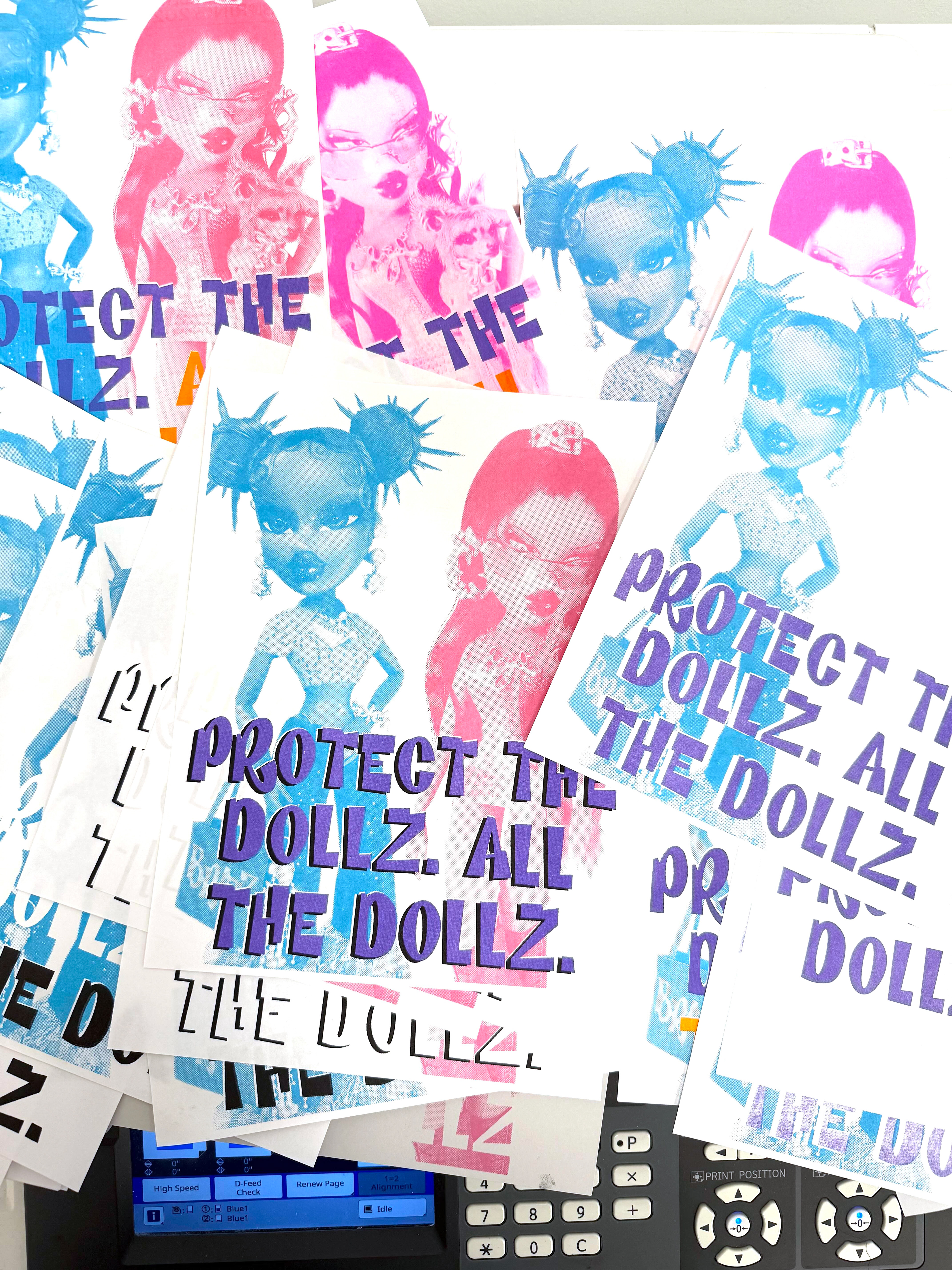
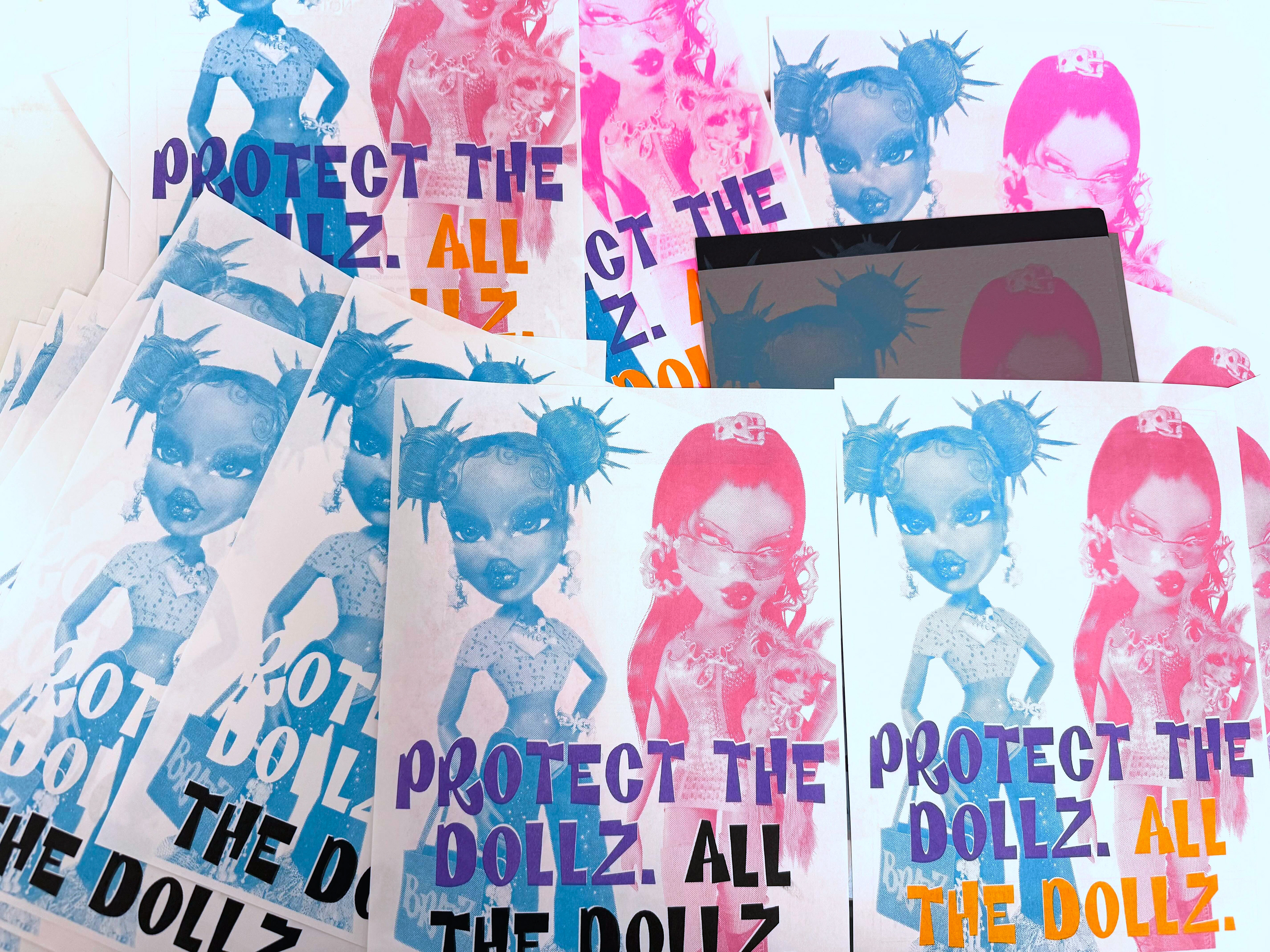
Protect the Dollz. All the Dollz. is a protest risograph print that uses pop culture imagery and direct language to address protection, vulnerability, and solidarity. By reclaiming the figure of the doll, the work draws attention to bodies that are often infantilized, policed, or denied protection, while insisting on care and defense for all, especially those most marginalized.
The project asks whose bodies are considered worthy of protection and whose are rendered disposable. Through humor and familiarity, the print lowers barriers to engagement while delivering a clear political message about inclusion, safety, and collective responsibility. The work is designed to function in public contexts such as protests, community spaces, and everyday circulation rather than as a singular art object.
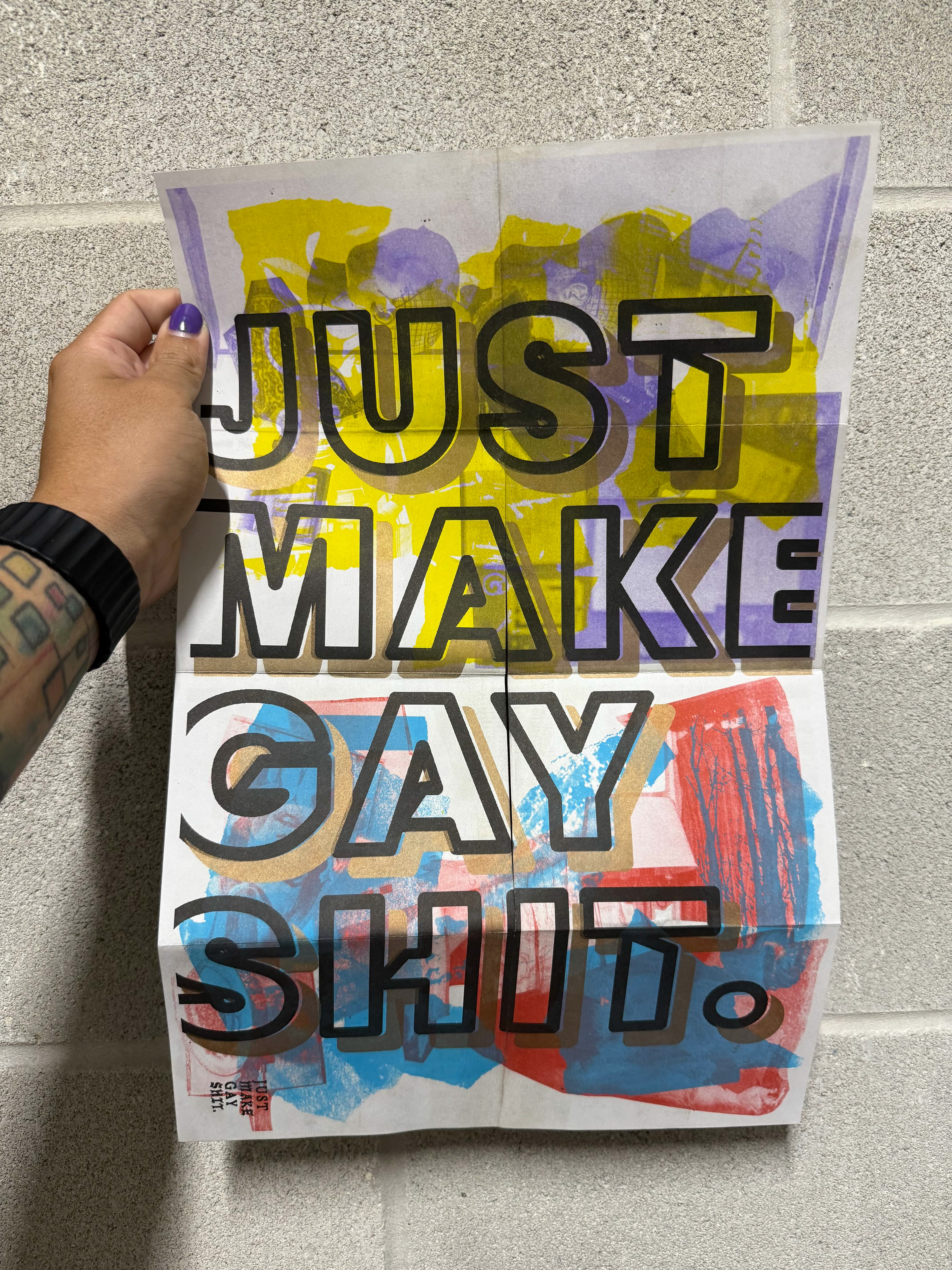
Risograph printing is central to the project’s intent. Historically associated with grassroots publishing, zines, and protest movements, risograph enables low-cost, high-volume production and wide distribution. Its visible layers, bold color, and imperfections resist polish and neutrality, reinforcing the urgency and humanity of the message. The process of producing multiple test prints reinforces the project’s emphasis on accessibility, repetition, and collective use rather than singular authorship.
This work positions print as a shared tool for solidarity rather than a precious object.
This protest poster, titled “H MAN R GHTS”, asserts trans inclusion as a fundamental human rights issue. Using the colors of the transgender flag and intentionally fragmented language, the work emphasizes that inclusion is not implied or optional, but must be explicitly named and defended.
The poster is designed to be immediately legible in public space. By stripping the message down to text and color, the work avoids representational imagery and instead centers language as a site of power. The visual simplicity allows the message to travel easily across contexts such as protests, classrooms, community spaces, and everyday environments, where clarity and repetition are essential.
This project uses print as a tool for visibility and collective affirmation. Its format supports wide distribution and shared ownership, allowing the message to circulate safely and consistently, including in contexts where anonymity is necessary. The work insists that human rights frameworks must actively include trans people rather than treating inclusion as implicit or symbolic.
The poster positions language itself as a form of protest and public accountability.
Trans Forming Politics is a project that explores how political language, systems, and visual culture shape understandings of gender, power, and belonging. The title operates as a deliberate double meaning, referencing both the act of transforming politics and the ways trans people form political presence, community, and resistance.
The work engages trans and gender-expansive perspectives to question who is legible within political discourse and whose experiences are excluded or misrepresented. Through research, visual experimentation, and participatory elements, the project examines transformation as both a personal and political process.
Rather than presenting fixed answers, the project creates space for dialogue and reflection, emphasizing how identity, policy, and representation intersect in lived experience. Design is treated as a civic tool that can challenge dominant narratives and invite more inclusive ways of thinking about governance, rights, and participation.
This project was created as part of the Get There Program, an initiative led by Movability that encourages people to plan more sustainable and accessible commutes. The campaign focused on expanding awareness of transportation options beyond driving alone, including walking, biking, public transit, carpooling, and other shared mobility choices.
The work highlights people across different races, cultures, body abilities, and lived experiences to emphasize that mobility and safety are not experienced equally. By visualizing multiple ways of moving through the city, the project draws attention to how transportation choices are shaped by infrastructure, policy, and circumstance rather than individual preference alone.
By centering everyday commuting, the project connects large-scale transportation planning to lived experience. It frames mobility as a civic issue tied to equity, access, and environmental responsibility, encouraging people to consider how daily movement through the city reflects broader systems of inclusion and care.
This collaborative zine, titled Trans-Zine, was created in connection with Transgender Day of Remembrance through Transcend, the student-led transgender organization at Texas State University, where I serve as faculty advisor. The zine was developed as a space for reflection, remembrance, and collective care, centering trans and gender-expansive voices during a time of grief and solidarity.
The project prioritized consent, safety, and choice around visibility. Participants were invited to contribute in ways that felt appropriate to them, whether through writing, imagery, or anonymous presence. Rather than extracting stories, the zine functioned as a shared container for mourning, support, and mutual recognition.
By using independent publishing as the format, the project emphasized intimacy, accessibility, and community ownership. The zine circulated within trusted spaces, reinforcing the importance of care-driven distribution when working with vulnerable communities.
The project treats publishing as a shared act of care, allowing remembrance to exist within community rather than public display.
PTown is a project that engages Provincetown as a site of queer history, visibility, and cultural memory. Developed in response to a brief to reimagine a city identity, the project centers Provincetown’s role as a longstanding refuge, gathering place, and cultural anchor for LGBTQIA+ communities.
The visual language of PTown draws intentionally from queer protest and celebration histories. The identity incorporates the typeface Gilbert, designed in honor of Gilbert Baker, the creator of the original Rainbow Flag and a lifelong LGBTQ activist. Referencing Baker’s legacy connects the project to traditions of protest, visibility, and collective making, situating civic identity within a lineage of queer resistance and care.
Color is used symbolically rather than decoratively. The palette references key moments in LGBTQIA+ civil rights history, including the national legalization of same-sex marriage, while resisting a simplified or static reading of progress. Rather than flattening history into branding, PTown treats identity as layered, political, and ongoing.
Feminist Camp originated as a rebrand project for a platform that explores feminist perspectives on culture, collaboration, and community. The work begins with an exploration of how a visual identity can reflect and reinforce values such as accessibility, mutual support, collective authorship, and expansive definitions of care and participation.
The identity system draws from visual language associated with protest and civic engagement. The typeface Activist, designed by Gayaneh Bagdasaryan, was selected for its political origins and bold, uncompromising presence. Its use reinforces the project’s emphasis on visibility, collective voice, and refusal of neutrality, aligning the visual identity with feminist traditions of resistance and public expression.
Rather than boxing feminism into a single narrative or aesthetic, the rebrand emphasizes multiplicity and ongoing conversation. The work considers how a visual system can function as a flexible framework that evolves alongside community dialogue, participation, and change.
Pink Circles, Blue Squares is a self-published research project that examines how gendered assumptions are embedded in visual culture, particularly within design education and professional practice. The work reflects on how seemingly neutral choices in color, form, language, and systems often reproduce binaries and reinforce exclusion.
The project combines research, visual examples, and accessible exercises to encourage designers to recognize how bias operates at both conscious and subconscious levels. Rather than prescribing solutions, the work invites reflection, dialogue, and responsibility as starting points for more inclusive design practices.
Positioned as a guide rather than a manifesto, the project bridges theory and practice through an approachable publishing format. It frames design as a cultural system shaped by values, habits, and power, and emphasizes the role of designers in questioning defaults and actively participating in change.
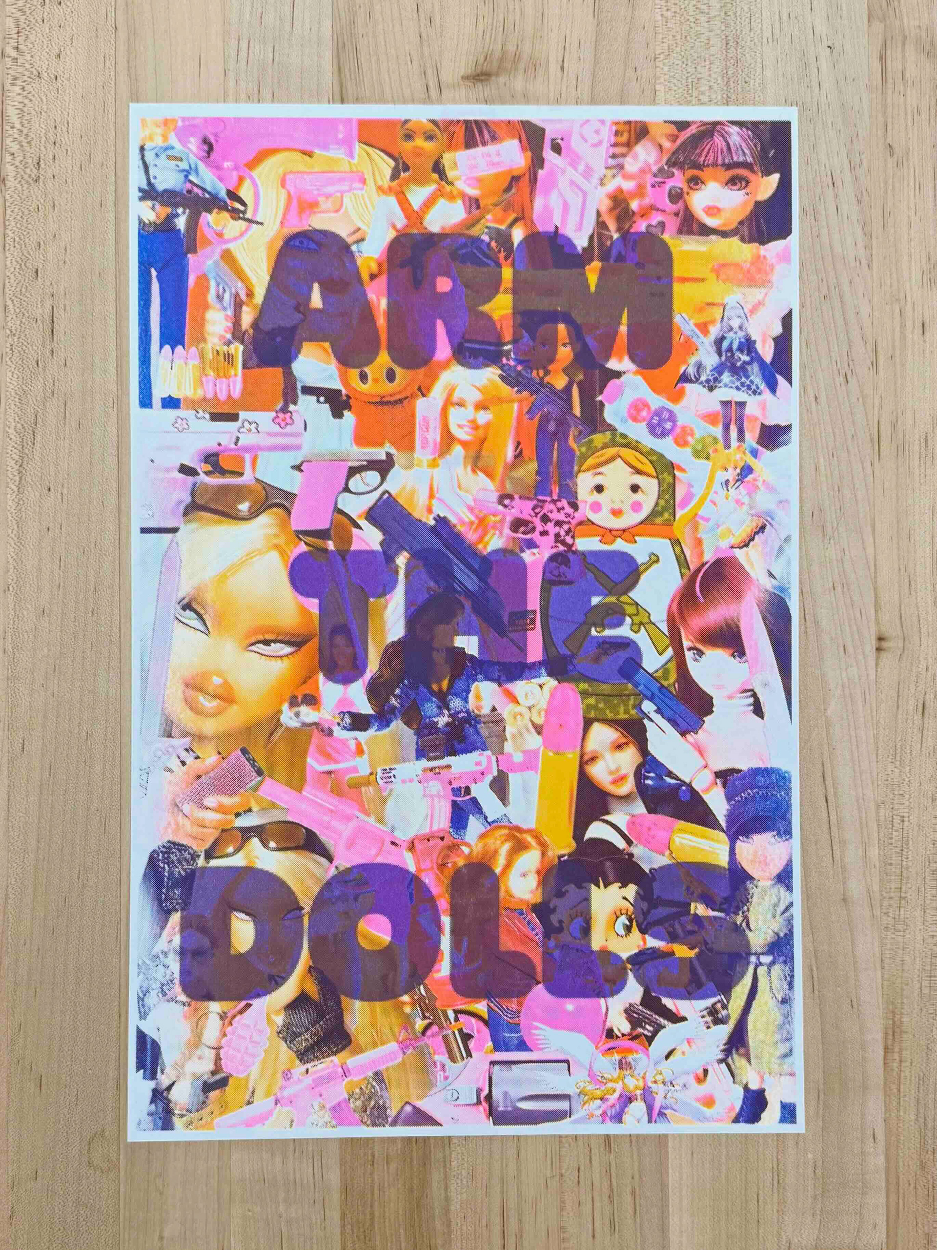
Together, these projects reflect an ongoing practice grounded in protest, care, and collective responsibility. Across different formats and contexts, the work prioritizes circulation, accessibility, and community-led authorship, approaching design as a civic practice shaped by lived experience and shared accountability. Rather than fixed outcomes, these projects are meant to adapt, travel, and support collective empowerment by remaining in conversation with the communities they engage.
